With burnout and mental health issues on the rise, many people struggle to identify health issues early and delay seeking help, leading to more severe consequences. My responsive web app is designed to tackle this challenge.
Responsive Web App / UX Research / UX/UI Design / Interactive Design / Usability Test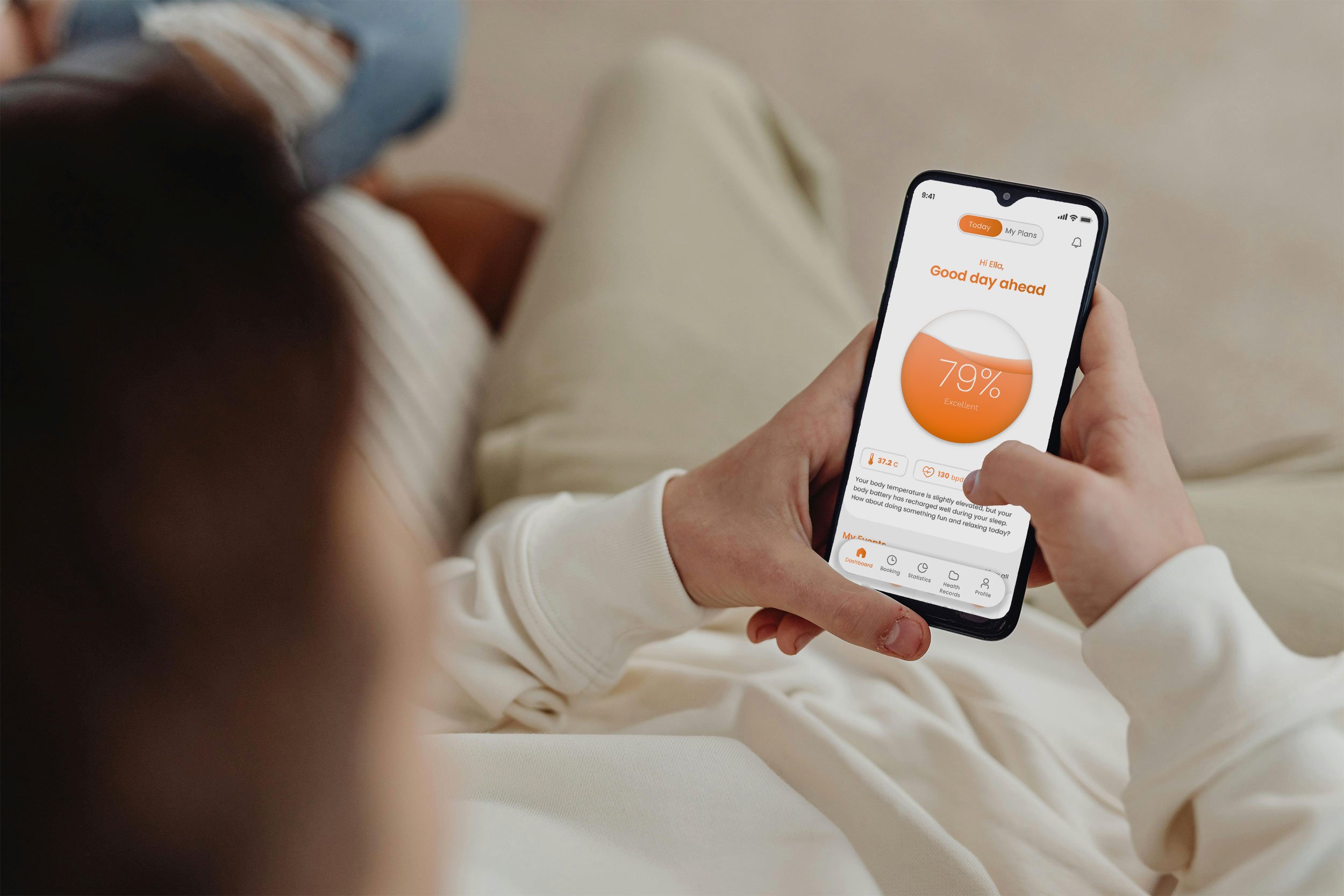
Project
UX/UI
Solo Student project
Duration 5 months
2023 - 2024
About
The goal was to create a supportive healthcare platform where users can take control of their mental and physical health. By integrating predictive technology and emotional AI, the app fosters proactive care and seamless doctor-patient communication.
The Challenge
People Delay Seeking Help, Leading to More Severe Consequences
Despite the growing awareness and abundance of tools aimed at mental health and wellness, burnout rates continue to rise. Many people struggle to identify health issues early and delay seeking help, leading to more severe consequences. Wellness is a significant trend, with individuals looking for ways to balance health, work, and life, yet there remains a significant gap between the knowledge available and the actions taken. Why are so many still hesitant to seek help early, despite having the resources to do so?
Through extensive user research, it became clear that 100% of participants felt their concerns would not be taken seriously by managers or healthcare professionals, leading them to ignore early symptoms of burnout.
My Solution
Proactive Support: Validating User Health Concerns
My solution leverages emotional AI and wearable devices to help users proactively manage their mental health and prevent burnout. By calculating personalized risk scores based on individual health behaviors and medical history, the platform provides tailored insights and actionable advice. This empowers users to identify potential health issues early, fostering a supportive environment where they can take informed steps toward better well-being.
The app also acts as a vital support system, notifying users when alarming changes in their health data are detected. This information serves as validation for users, equipping them with concrete data to share with doctors and healthcare professionals.
White Paper Research
Burnout Crisis: Rising Year After Year
In my initial research, I identified the alarming increase in burnout rates, with a 13.5% rise from 2021 to 2022. Despite widespread awareness and numerous articles emphasizing the importance of early intervention, individuals often fail to take action until the problem becomes severe.
Competitive Analysis
A Unique Opportunity: The Competitors Lack of Focus on Early Intervention in Healthcare
I examined various healthcare platforms, noting their distinct offerings and approaches. While there were no direct competitors focused on early intervention, this analysis revealed valuable insights into the healthcare app landscape and potential areas for innovation.
One of the most significant insights from my competitor analysis was the absence of direct competitors dedicated to facilitating early intervention for burnout and mental health issues. While many existing healthcare platforms offer comprehensive data access or specialized services, few prioritize encouraging users to reach out for help before their challenges escalate.
This gap highlighted an opportunity for Wholesome+ to differentiate itself by fostering a proactive approach to mental health.
User Research
“I was 100% sure no one would believe me”
To gain deeper insights, I conducted focus groups and interviews with individuals who had experienced severe burnout. A striking revelation emerged: all participants felt that no one would take their concerns seriously. Even though they recognized early symptoms of burnout, fear of being dismissed by their managers or healthcare professionals led them to delay seeking help.
Additionally, I conducted a survey to gather quantitative data, which reinforced the findings from the qualitative research. To further synthesize these insights, I used affinity mapping and empathy maps, allowing me to identify common themes and better understand user emotions and experiences. This comprehensive analysis revealed a pressing need for a platform that not only validates users’ experiences but also encourages proactive communication with healthcare providers.
Key Insights / Interview
1.
Participants expressed feeling overwhelmed when booking doctor appointments during the burnout stage, and wished for simpler solutions in accessing medical care.
2.
The fear of not being believed by doctors or managers prevented participants from seeking help. They also struggled to recognize the right time to seek medical assistance.
3.
Participants expressed significant concerns about their privacy and desired more transparent solutions for document access.
User Personas & Journey Maps
User Personas: Navigating the Journey to Validation
With these insights in mind, I developed personas to encapsulate the motivations, needs, and pain points of users experiencing burnout. This understanding allowed me to create journey maps that highlight key opportunities for the app to effectively address these challenges throughout their healthcare journey. I focused particularly on one critical journey: seeking help for burnout, especially the need for users to feel validated in their feelings and experiences.
Meet Johny, Ella, and Sara—three personas representing the diverse experiences and barriers users face when navigating their mental health.
Persona 1:
Johny, 42,
Head of Customer Communications
Why Johny is important:
He represents users who are highly committed to their jobs but suffer from burnout due to a lack of boundaries and self-care.
Johny represents users who need help managing burnout while fearing that no one will take their struggles seriously.
He represents users who feel overwhelmed by the process of booking doctor's appointments, especially in the midst of burnout, which often leads them to delay seeking help.
His privacy concerns highlight the app’s need for clear, user-controlled access to health data, a key issue from user research.
Johny's Journey:
Johny's journey emphasizes the critical need for validation during his burnout recovery.
By streamlining the appointment booking process through a direct notification, the app addresses his concerns about being taken seriously by healthcare providers.
His journey highlights the app’s ability to simplify health data and provide validation, empowering users to seek help when mental health is at risk.
This feature not only simplifies the booking process, reducing the overwhelm he experiences during stressful times, but also reinforces the app's role in supporting users when they may doubt their need for help.
Persona 2:
Ella, 35,
Art and Design Student & DJ
Why Ella is important:
Ella's persona represents users who lacks the tools to recognize when to stop.
Ella is a creative who often ignores burnout until it’s too late.
She’s afraid her symptoms won’t be taken seriously.
Ella’s persona validates the importance of wearables and technology in providing preventive healthcare.
Her frustration with unclear medical terminology also reinforces the app’s focus on simplifying health data
Her persona underscores the need for tech to not only detect burnout early but also validate her feelings, offering clear and actionable advice without overwhelming data.
Ella's Journey:
Ella's journey illustrates the app’s adaptability to different personality types.
Her initial skepticism about the notification reflects a common struggle many users face—doubting their need for assistance.
By showing her hesitance followed by eventual acceptance and relief when her feelings are validated by the doctor, the journey highlights the app's importance in fostering emotional support.
This narrative reinforces the app's commitment to guiding users through their mental health challenges and providing them with the encouragement they need to seek help.
User Flows
Navigating the Path to Help
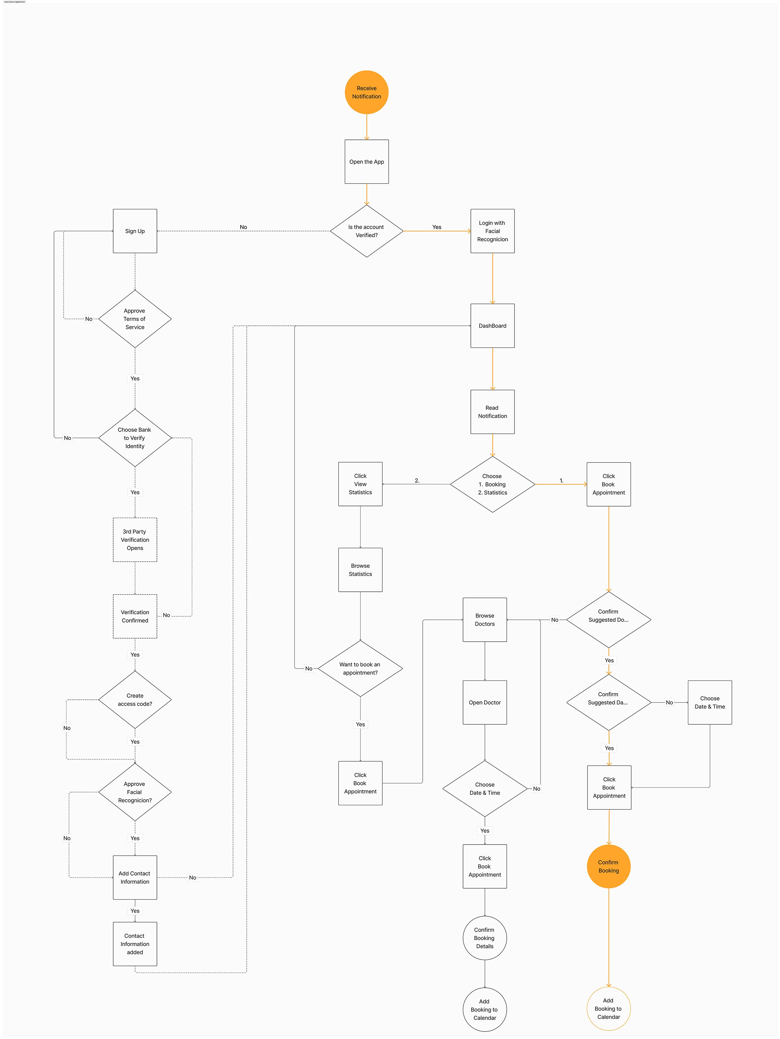
In designing the user flows, I maintained a strong focus on the journey of seeking help for burnout, particularly highlighting the critical need for users to feel validated in their feelings and experiences. These flows illustrate how the app facilitates a supportive and intuitive process, guiding users toward the resources and connections they need to prioritize their mental health.
Want a closer look? View User Flow in full size here
Mobile First Design Plan
Prioritizing Mobility: Crafting a User-Centric Design Plan
I created a mobile-first design plan for the responsive web app, prioritizing optimal usability on mobile devices while ensuring adaptability across smartphones, tablets, desktops, and wearables. This approach aligns with the diverse needs of our user base, allowing for a seamless experience. While the primary focus is on mobile, the plan also supports desktop usage for tasks like reading documents and conducting telemedicine, catering to varied user preferences.
Design Phase: Purpose-Driven Decisions
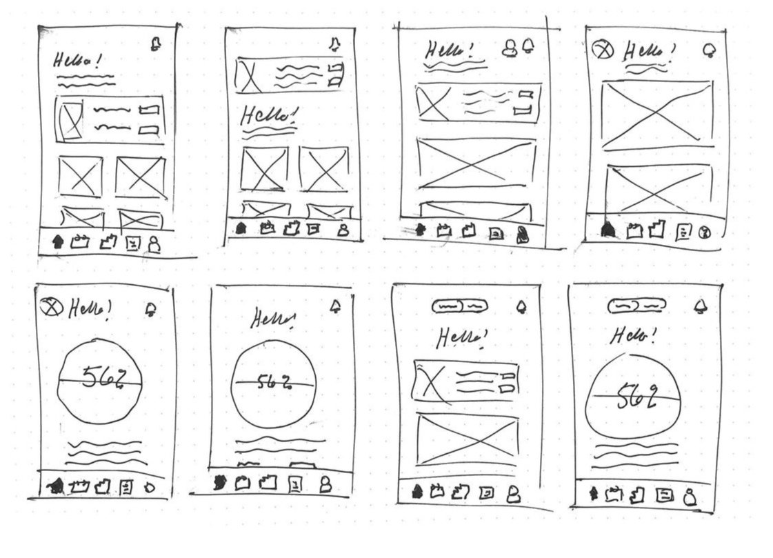
In the design phase, my focus was on ensuring that every decision was rooted in user needs and insights gathered from research. Sketching key screens allowed for rapid iteration and refinement, enabling a user-centered approach to layout and functionality.
Problem statement 1.
How might we help users to interpret their health data & seek help early on?
Problem statement 2.
How might we ensure user privacy and control over document access?
Sketching
Low-to Mid-Fidelity
Usability Testing
Discovering Onboarding Problems
Conducting usability tests was key to evaluating the effectiveness of Wholesome+ in empowering users to monitor their health and seek timely medical assistance. Insights from these tests directly informed necessary improvements, such as clarifying the onboarding process to enhance user engagement.
Key Improvements
Task 1. : Sign up
Error rating: 4 - High Severity
The onboarding screens and Sign up- process were indentified as confusing during the test.
Suggested Change:
Clear CAT -button for Sign up -process placed on the first screen. Users can swipe through onboarding screens, and click to sign up from all screens.
Before:
After:
Final solution
The final product reflects a thoughtful design process that kept user needs at its core. By adhering to these principles and guidelines, I was able to create an interactive prototype using Figma, which facilitated collaboration, animation of graphics, and user testing throughout the project timeline.
Feature 1.
Get a clear overview of health
Dashboard visualize your overall health index based all the data, to get a better scope
Illness detection will guide you to make better healthier choices and to predict future
Learn how events in your life are tied to changing levels of anxiety, stress and depression
Justification
Participants expressed difficulty in understanding their overall health (focus group and user interviews). A dashboard health index would enable users to better grasp how individual data points affect one another.
Some participants mentioned they don’t want to track individual data statistics daily but would prefer a better understanding of their overall health state (interview).
Feature 2.
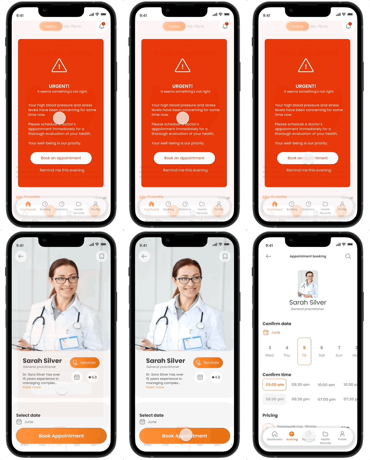
Get notified if alarming changes are detected
1st Notification
2nd Notification
Predictive healthcare helps you to detect changes
in your body early onSimplified solutions in accessing medical care during burnout phases
Appointment booking made easy to the best suitable doctor with only few clicks away
Get guidance and help for more balanced & healthier life and avoid severe illnesses
3rd Notification
Justification
100% of participants reported difficulty in knowing when it’s the right time to seek help (focus groups and user interviews), often leading to delayed appointment bookings and more severe burnout and depression.
All participants (100%) felt that no one would take their concerns seriously (focus groups and user interviews). Even though they recognized early symptoms of burnout, fear of being dismissed by their managers or healthcare professionals led them to delay seeking help.
Participants also expressed feeling overwhelmed when booking doctor appointments during the burnout stage (focus groups and user interviews). A notification system that directs users to the most suitable doctor with just a few clicks could help reduce the emotional burden of seeking help.
Feature 3.
Transparent solutions for your privacy
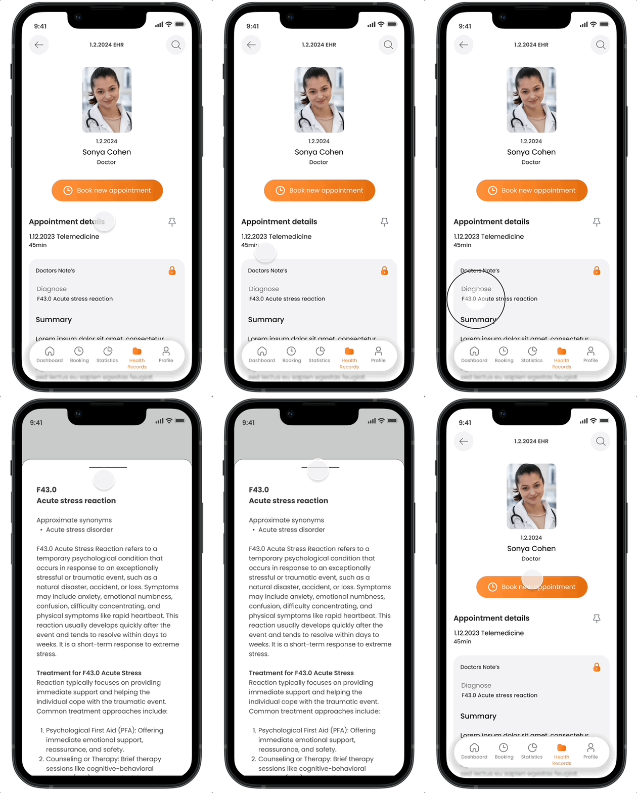
Control Reading Permissions
An AI-enabled 'Look-up' feature
Store all you healthcare documents in one place
Monitor your privacy and control reading permissions
Get notified when your documents have been opened and viewed
Look up -feature helps you to easily understand all medical words and the meaning of codes
Justification
Participants expressed significant concerns about their privacy (focus groups, user interviews, and surveys). Providing an option to monitor privacy settings and control reading permissions would help users feel more secure about their sensitive information.
Some participants reported difficulties interpreting medical terminology and codes (interviews), leading to uncertainty or extra time spent searching online. An AI-enabled 'Look-up' feature could significantly reduce the time spent and help users feel more in control of their health.
User Interface Design
Energizing Design: Color, Comfort, and Clarity
Color psychology guided my choice of a vibrant orange as the primary color, evoking energy and positivity to create an engaging user experience. The typography, featuring Poppins, was selected for its modern, friendly appearance and excellent readability, fostering clarity and comfort across devices.
The app’s design emphasizes emotional connections, with features like the animated health indicator, virtual waiting rooms to enhance user comfort and haptic feedback from wearables to provide important notifications. By creating a cohesive tone of voice that reflects positivity and support, I aimed to build trust and encourage user engagement throughout their health journey.
Conclusion & Reflections
In conclusion, this project has been an invaluable learning experience, providing insights into the intricacies of user experience design and the importance of prioritizing user needs. Through this project, I have learned:
Prioritization: It's just as important to understand what to leave out as it is to know what to prioritize, especially when time is limited. My first version, or minimum viable product, may not have all the desired features, but I can continue to refine it and plan for improvements in the future.
Design systems: Establishing a design system is essential. I started working in Figma without a structured design system, and as I added more screens, inconsistencies quickly emerged. I realized how crucial it is to set up a design system from the start.
What I’d do differently
I’d conduct preference testings more often to validate the screens more efficiently
I’d arrange a usability testing with low-fidelity wireframes to detect severe usability errors early on.
Overall, this project has deepened my understanding of UX design principles and methodologies, equipping me with valuable skills and insights for future projects in the field.
Check out similar works
Unmute Your Language Skills
Revolutionize cooking by voice commands


