Gain confidence in real-world communication, fostering fluency and cultural understanding for diverse linguistic experiences.
iOS Mobile App / UX Research / UX/UI Design / Branding / TestingProject
UX/UI
Solo Student project
Duration 2 weeks
2023About
The goal of the project was to design a mobile application that empowers people to learn new languages effectively and efficiently.
Design Process
My Role
As this was a solo UX project, my responsibilities spanned the entire product development lifecycle—from secondary research, conducting competitor and user research to defining user needs and personas. I developed user flows and task analyses, created wireframes and prototypes, and conducted usability testing to refine the interface and interactions.
The Challenge - Problem
Bridging the Confidence Gap
Learners often face anxiety and hesitation when applying new language skills in real-life contexts. This app addresses this challenge by focusing on practical vocabulary building, real-time conversational support, and cultural fluency.
My Solution
AI-Enhanced Language Tutoring
To boost confidence and fluency, I designed an AI-driven app with features like live conversation practice, real-time corrections, and personalized lessons. These tools support users in developing fluency, understanding grammar nuances, and expanding vocabulary daily.
"Can you share a situation where you wished to use this new language or vocabulary?"
Research
Defining users needs and problems
1 in 4 learners struggle with language anxiety, leading to avoidance in practical conversations.
Competitive Analysis / 3 apps: I evaluated top language apps, uncovering gaps in practical application, personalization, and accessibility for diverse user needs.
User Interviews / 6 participants: Key insights emerged around users’ needs for social interaction, practical language use, and validation, particularly in high-stakes settings like travel and business.
1 in 4
Suffers from language anxiety in social interaction, and practical language use
Key Insights / User Interview
1.
Social Utility
Users primarily seek language skills for social interactions, such as business events, travel, and special occasions, indicating a strong need for practical language use.
2.
Desire for Interaction
There is a significant demand for more interactive features within apps to avoid the isolation often felt with traditional vocabulary learning tools.
3.
Need for Personalization
Users emphasize the importance of easy navigation and personalized learning experiences tailored to their individual language goals and contexts.
Problem Statement
How might we design a mobile app that empowers people to speak new languages?
Key Design Stages
Personas
Based on the research insights, I was able to create personas to represent the diverse learning needs, emphasizing real-life language use, personalization, and user confidence-building.Task Flow
Mapped a user-centric journey for easy navigation from lesson selection to feedback, prioritizing minimal steps and reducing learning friction.Wireframing & Prototyping
Developed and tested low-to-high fidelity wireframes, integrating feedback to improve clarity, interactivity, and lesson personalization.High-Fidelity Prototype
Implemented personalized lesson features with an AI avatar for conversational feedback. Removed unnecessary navigation based on usability testing to streamline focus.
Persona 1. Maya Matson, 47, Brand Manager
Why Maya is important:
Needs: Mobile-friendly, efficient learning with instant feedback.
Value: Highlights need for flexible, on-the-go language learning.
Validation: Quick-feedback usability testing for busy professionals.
Want to have a closer look? Click here to enlargePersona 2. Carol Wendt, 56, Chef
Why Carol is important:
Needs: Beginner-friendly, structured language lessons to learn French.
Value: Drives inclusive, supportive design for slow or older learners.
Validation: Testing for simplicity, clear guidance, and gradual progression.
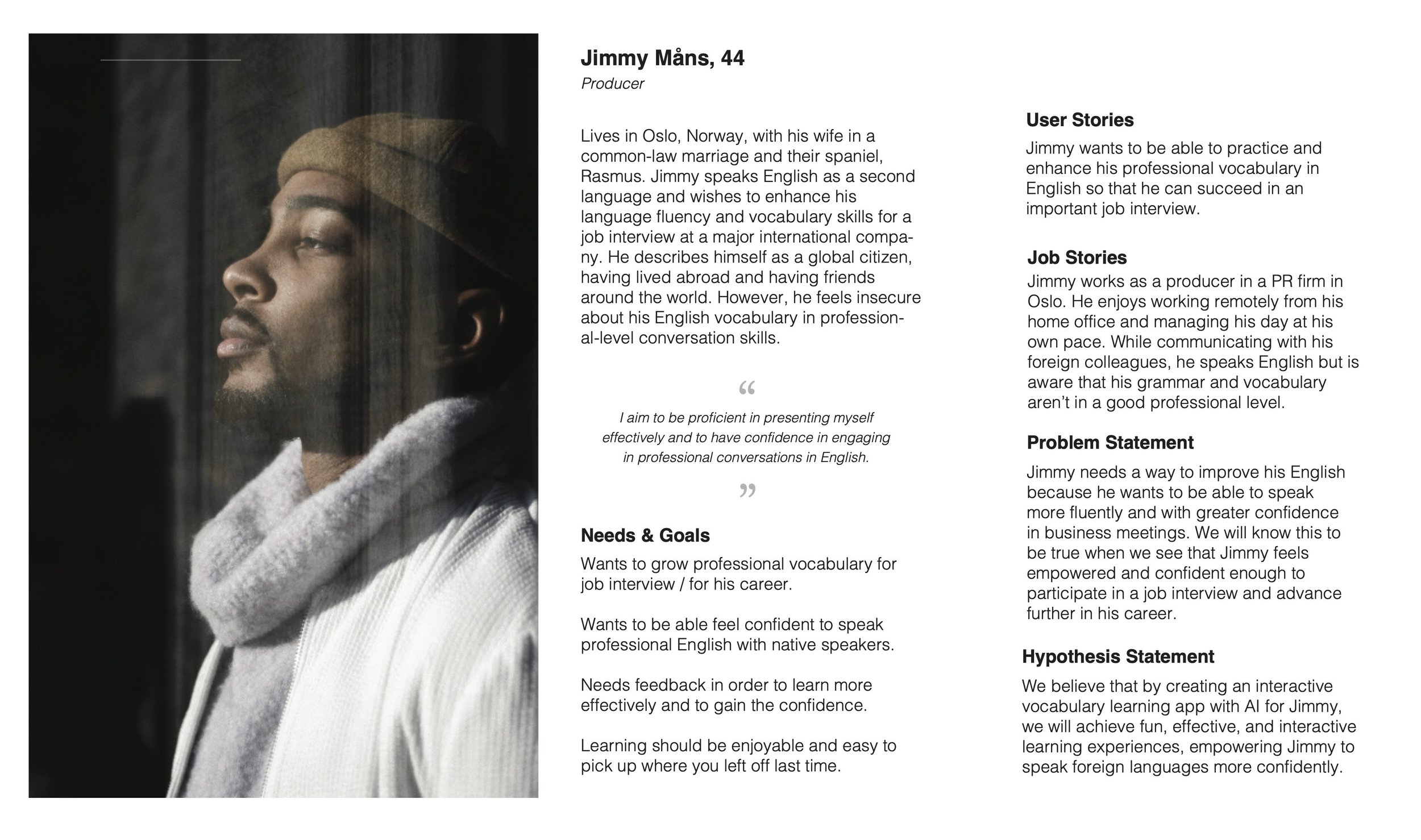
Want to have a closer look? Click here to enlargePersona 3. Jimmy Måns, 44, Producer
Why Jimmy is important:
Needs: Professional vocabulary-building and confidence for job interview.
Value: Guides specialized, goal-oriented modules for career-focused users.
Validation: Feedback testing on relevance and progress tracking for professionals.
Why Each Persona is Crucial for Project Success
Maya’s Persona emphasizes the importance of flexible, mobile-friendly design with instant feedback, ensuring the app meets the fast-paced needs of professional users.
Carol’s Persona represents users who are slow learners or beginners, guiding the app’s accessibility, encouraging design, and structured lessons, broadening its appeal.
Jimmy’s Persona highlights the demand for specialized, professional language support, driving the need for goal-oriented vocabulary tools and progress-tracking for confidence in high-stakes situations.
Task Flow
Next, I delved into the task flow designed to streamline the user experience from opening the app to completing a lesson and providing feedback. By mapping out this process, I wanted to ensure a seamless journey for users as they engage with the language learning platform.
Want to have a closer look? Click here to enlarge
Card Sorting & Wireframing
I started rapid prototyping with low-fidelity sketches. I tried different methods, like the Crazy Eight and time blocking. I brainstormed solutions for each problem and how to find best solution for each step.
To offer lessons for all occasions, my goal was to have two types of lessons: generated and customized. My initial idea was that during the lessons, an AI Avatar would interact with the user, providing useful feedback immediately. More comprehensive feedback data would be provided to users after completing the lesson.
Usability Testing Key Findings & Design Iterations
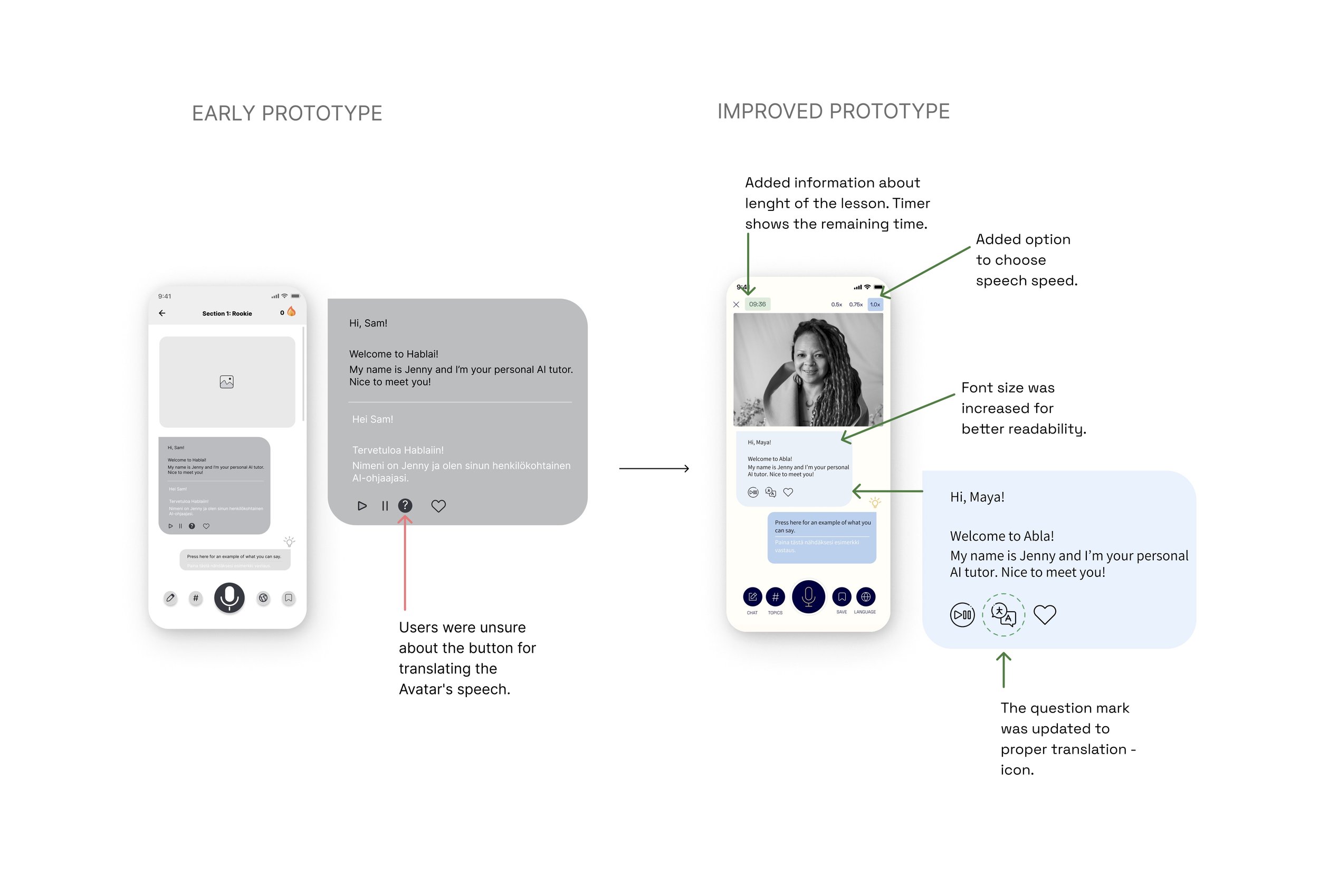
1. Translation Icon and Readability
Early Prototype Finding: Users were unsure about the icon for translating the AI tutor’s speech.
Improved Prototype:
Updated the question mark icon to a clear translation icon, making it intuitive for users to translate as needed.
Increased font size for better readability.
Added an option to adjust the AI tutor's speech speed for users to control comprehension and comfort.
Value: Clear iconography, adjustable speech speed, and readability enhance usability and reduce cognitive load.
Why: By making these adjustments, users can engage more comfortably with the AI tutor, ensuring they focus on learning without distraction.
2. Lesson Length and Progress Indication
Early Prototype Finding: Users wanted information on lesson length and progress.
Improved Prototype:
Added a timer showing lesson length and remaining time, enabling users to manage their learning sessions better.
Value: Providing time-related information enhances user control, especially valuable for those with time constraints.
Why: This helps users allocate time confidently and maintain focus throughout the lesson.
3. Navigation and Toggle Button Simplification
Early Prototype Finding: The toggle button and bottom navigation felt cluttered, with users expressing they only used the lessons accessible via scroll.
Improved Prototype:
Converted the toggle button to a carousel for favorites, language, and course selection.
Removed bottom navigation, reducing clutter and adding a burger menu for accessing admin content.
Value: Simplified navigation improves focus and decreases visual complexity, making it easier to access core features.
Why: A streamlined UI aligns with user goals, allowing faster access to lessons without distractions.
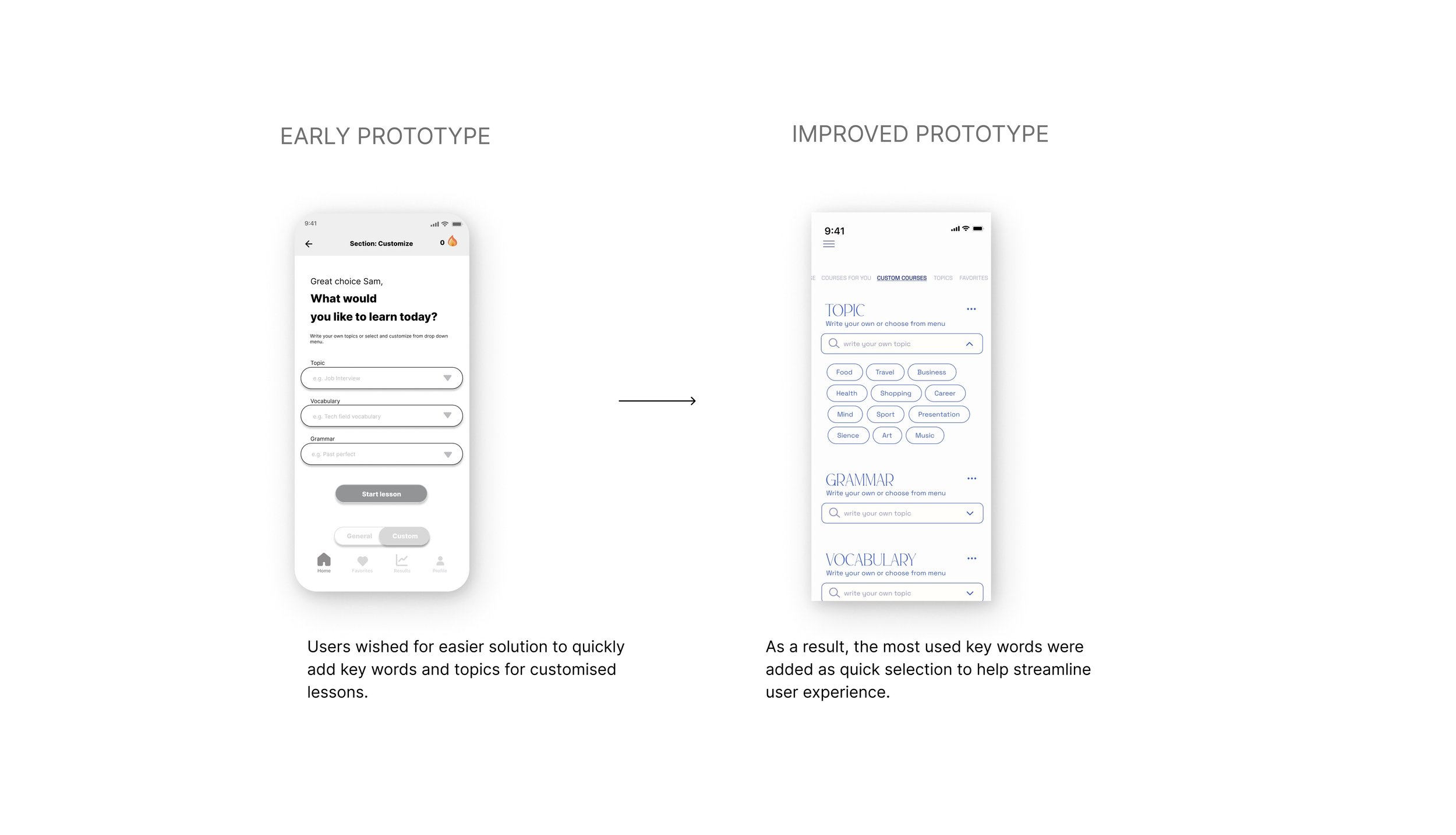
4. Custom Lesson Personalization
Early Prototype Finding: Users wanted an easier way to add keywords and topics to customized lessons.
Improved Prototype:
Introduced a quick-select feature for commonly used keywords, facilitating a smooth, quick lesson setup.
Added an AI tutor selection screen, letting users pick a tutor for each lesson or save a preferred one as default.
Value: Personalization options increase relevance and engagement in lessons, helping users feel connected to their learning process.
Why: Personalized AI tutors and keyword quick-select streamline customization, making it easier for users to adapt lessons to their preferences.
5. Daily Word Screen UI and Guidance
Early Prototype Finding: The Daily Word screen lacked hierarchy and guidance, impacting user navigation.
Improved Prototype:
Refined hierarchy and added in-depth guidance to the Daily Word screen to maximize ease of use.
Value: A well-organized screen with clear instructional hierarchy enhances learning by guiding users step-by-step.
Why: Strong UI hierarchy clarifies content prioritization, encouraging daily engagement with the app.
Sign up & Login
Final Features
Customizable Lessons: Choose personalized topics, grammar focus, or specific vocabulary goals tailored to each user’s learning context.
AI Avatars for Conversational Practice: AI avatars support learning with immediate feedback, addressing language anxiety and boosting user confidence.
Intuitive Navigation: Simplified UI with a hamburger menu to access settings and customization, enhancing focus on lesson content.
Onboarding & Questionary for personalization
Choose Personalized lessons, or custom own topic.
The app offers personalized language learning lessons and custom lessons, empowering users to take control of their learning experience. With personalized lessons, users can insert their own topics, grammar rules, or vocabulary, allowing them to focus on areas most relevant to their learning goals. These personalized lessons are designed based on a thorough onboarding questionnaire, ensuring that the content is tailored to each user's proficiency level and learning objectives.
Navigation, Home Screen, and Customized lessons
Navigation
Through usability testing, we gathered valuable feedback from users. One key insight was that users did not find the bottom navigation necessary, as they primarily used the lessons. As a result, we removed the bottom navigation to streamline the user experience and reduce clutter. Additionally, we introduced a burger menu as an easy and simple way to access all admin area content, ensuring that users can easily manage their personalized lessons and preferences.
General courses
Choose Your Own AI Avatar
With our personalized language learning feature, users can embark on a tailored learning journey that meets their individual needs and preferences. By offering customizable lessons and intuitive navigation, we aim to empower users to achieve their language learning goals with confidence and efficiency.
Choose your AI tutor and start a lesson
Reflection & Key Takeaways
This project underscored the power of iterative testing and user-driven insights to refine design and maximize engagement. I learned the importance of clear contrast for readability, alongside balancing personalization and navigation simplicity for an intuitive user experience. As this was my first digital design project, I learned a lot. Here are the key takeaways from this invaluable learning experience:
Accessibility plays pivotal role in digital design. I learned the hard way that colors behave differently on screens than they do in physical samples: clear color contrast and easy to read typefaces are important to avoid readability issues. Despite having honed my skills in color theory, this experience served as a valuable lesson in adapting to the tech environment. Fortunately, I gained this insight early in my UX journey, during my first case study.
Iterative Testing and Feedback: Iterative testing and feedback loops were essential for refining and enhancing the user experience. I learned that gathering feedback and arranging usability testings as early as possible, will benefit the product design process a lot. By continuously gathering feedback and making iterative improvements, I can address usability issues and optimize the user journey for increased satisfaction.
Personalized Features and Tailored Content: Personalization plays a significant role in enhancing user engagement and satisfaction. By offering personalized features and tailored content, we can create more relevant and meaningful experiences that resonate with individual users.
Clear Communication and Intuitive Navigation: Clear communication, icons and intuitive navigation are essential for guiding users seamlessly through the platform. By prioritizing clarity and simplicity in design, we can minimize friction and help users achieve their goals more efficiently.
What I would do differently?
I would have conducted a more comprehensive competitive analysis, exploring a broader selection of language learning apps. A deeper dive into a SWOT analysis could have uncovered additional opportunities for the project. However, due to the tight timeline of only two weeks, I quickly transitioned to conducting interviews and user research.
Overall, this project has deepened my understanding of UX design principles and methodologies, equipping me with valuable skills and insights for future projects in the field. It has been an enriching experience that has prepared me to tackle new challenges and create impactful user experiences in the future.
Check out similar works
Next Gen Healthcare - Preventing Burnout
Revolutionize cooking by voice commands


